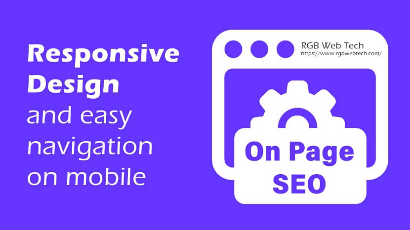
In today’s digital world, having a mobile-friendly website is critical for improving user experience and boosting search engine rankings. Responsive design plays a vital role in ensuring that your website adapts seamlessly across all devices. Here's how you can implement this On Page SEO strategy to improve website visibility and increase traffic.
1. What is Responsive Design?
Responsive design is a web development technique that ensures your website layout adjusts automatically based on the screen size and orientation. This means your site will look great and function efficiently on desktops, tablets, and smartphones.
2. Why Responsive Design Matters for SEO
- Improved User Experience: A responsive website provides easy navigation and readability on all devices, keeping visitors engaged.
- Better Mobile Rankings: Google prioritizes mobile-first indexing, so mobile-friendly websites have a higher chance of ranking well.
- Lower Bounce Rate: If visitors can easily navigate and interact with your content, they’re less likely to leave immediately.
- Faster Loading Speeds: Optimized mobile designs load faster, which improves overall SEO performance.
3. Steps to Implement Responsive Design
- Use a Mobile-First Approach: Design for smaller screens first and scale up for larger screens.
- Flexible Layouts: Use CSS grids and percentages instead of fixed widths for images and elements.
- Media Queries: Utilize media queries in CSS to apply different styles based on device size.
- Scalable Fonts and Images: Ensure all text and images adjust proportionally to screen size.
4. Easy Navigation on Mobile
Simplify navigation to improve user experience on mobile devices:
- Use a Hamburger Menu: Collapsible menus save space and enhance readability.
- Clickable Buttons: Ensure buttons and links are large enough to be tapped easily.
- Sticky Navigation: Keep navigation menus accessible as users scroll.
- Search Functionality: Add a prominent search bar for users to quickly find content.
5. Benefits of Responsive Design for Traffic and Engagement
- Higher Traffic: Improved user experience leads to higher website visits and return visitors.
- Increased Conversions: Easy navigation and fast-loading pages increase conversions and sales.
- Enhanced Sharing: Mobile users are more likely to share content on social media, further boosting visibility.
By adopting responsive design and optimizing for mobile navigation, you can effectively enhance your website’s on-page SEO, improve search rankings, and increase traffic.
Step-by-Step On-Page SEO Guide
44 Must-Know On-Page SEO Tips for Higher Traffic & Rankings
If you found this article helpful, we encourage you to share it on your social media platforms—because sharing is caring! For more information about article submissions on our website, feel free to reach out to us via email.
Send an email
Written by RGB Web Tech
SEO Checklist - Boost Your Website Ranking
Enhance your website performance with our Complete SEO Checklist. This detailed guide covers essential aspects like On-Page SEO, Off-Page SEO, Technical SEO, Backlink Building, Mobile Optimization etc. Follow our step-by-step SEO Checklist to improve search rankings, boost organic traffic, and achieve sustainable online growth. Start optimizing today!
"Content is king, but marketing is queen and runs the household." – Gary Vaynerchuk